
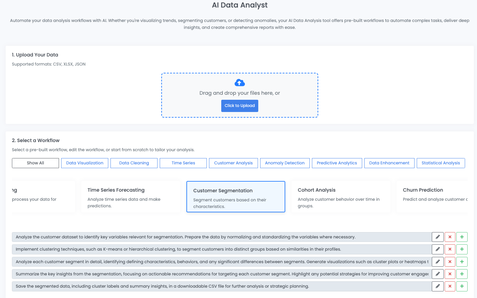
In this article, we'll use our AI data analyst agent to analyze and segment customers based on key demographic and behavioral variables to improve marketing strategies and customer engagement.
We'll use this customer segmentation data from Kaggle, which provides the following context:
An automobile company has plans to enter new markets with their existing products (P1, P2, P3, P4 and P5). After intensive market research, they’ve deduced that the behavior of new market is similar to their existing market.
Content
In their existing market, the sales team has classified all customers into 4 segments (A, B, C, D ). Then, they performed segmented outreach and communication for different segment of customers. This strategy has work exceptionally well for them. They plan to use the same strategy on new markets and have identified 2627 new potential customers.
You are required to help the manager to predict the right group of the new customers.
To perform this analysis, we'll use our customer segmentation prompt template, which is an agentic workflow using OpenAI's Assistants API.
Using the customer segmentation outputs from this agent, we've also put the findings into an interactive dashboard to explore both the segmented customers and input data:
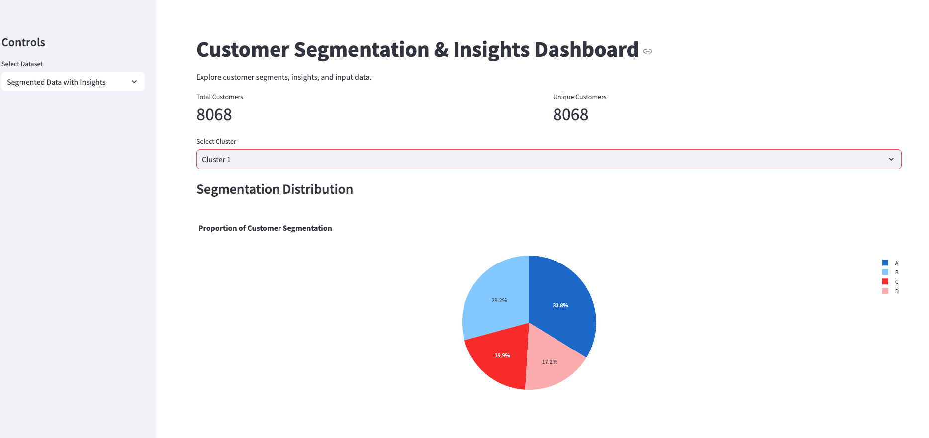
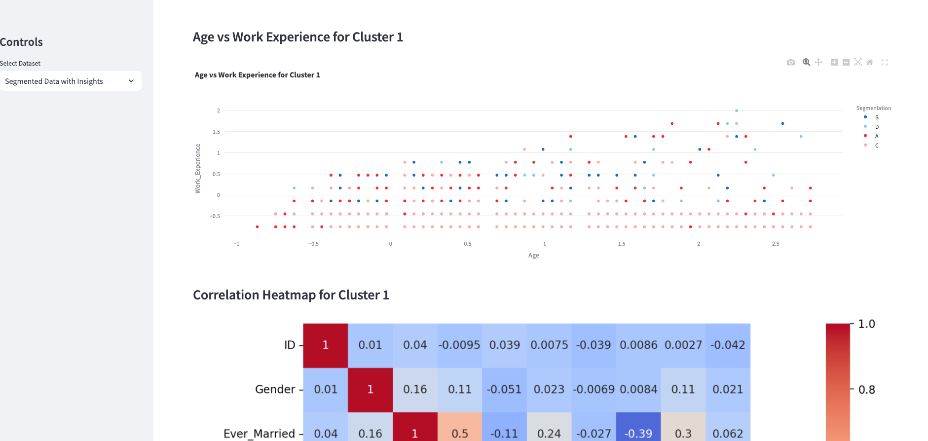
Table of Contents
- Executive Summary
- Data Preparation
- Customer Segmentation
- Segment Analysis
- Comparative Analysis
- Actionable Recommendations
- Segmented Data Output
- Appendix: Code Snippets
1. Executive Summary
This report provides a comprehensive analysis aimed at segmenting customers based on key demographic and behavioral variables to enhance marketing strategies and customer engagement. The data preparation involved selecting crucial variables such as age, gender, profession, work experience, family size, and spending score. We performed data normalization, standardization, and encoding to ensure the dataset was suitable for clustering analysis.
Using K-Means clustering, we identified four distinct customer segments:
- Segment 1: Young customers with varied spending habits and smaller family sizes.
- Segment 2: Mature customers with consistent spending patterns and balanced work experience.
- Segment 3: Professionals exhibiting high spending behavior and diverse age distribution.
- Segment 4: Value-conscious families with moderate spending habits and close-knit family structures.
Comparative analysis using visualizations highlighted significant differences among these segments in terms of age, work experience, spending habits, and professional backgrounds. Key insights reveal a diverse customer base with varying needs and preferences.
Based on these findings, actionable recommendations were developed for each segment, including personalized marketing strategies, loyalty programs, premium offerings, and value-focused promotions. Implementing these strategies is expected to improve customer satisfaction, retention rates, and overall business growth.
The report concludes with a segmented data output file, providing a structured dataset that includes cluster assignments and strategic insights to facilitate targeted marketing efforts.
2. Data Preparation
Key Variables Identification
User-based Demographics:
GenderEver_MarriedAgeGraduatedProfessionWork_ExperienceFamily_SizeVar_1
Behavior-based Metrics:
Spending_Score
We'll aim to use these variables for segmentation to help distinguish different customer groups.
Data Normalization and Standardization
- Numerical variables: Normalize or standardize
Age,Work_Experience, andFamily_Sizefor uniformity across scales. - Categorical variables: Encode
Gender,Ever_Married,Graduated,Profession, andVar_1into numerical form.
Rationale for Variable Selection
The chosen variables reflect both demographics (e.g., Age and Profession) and behaviors (e.g., Spending_Score) which can significantly impact customer segmentation strategies.
Let's conduct the data preparation by normalizing and standardizing the variables with the following steps:
- Imputation for Missing Numerical Values: Missing values in numerical columns (
Age,Work_Experience,Family_Size) were filled with their medians. - Standardization:Numerical variables (
Age,Work_Experience,Family_Size) have been standardized using z-scores. This ensures variables are on the same scale without affecting the relationships in the data. - Encoding of Categorical Variables: Categorical variables (
Gender,Ever_Married,Graduated,Profession,Var_1) were encoded numerically.
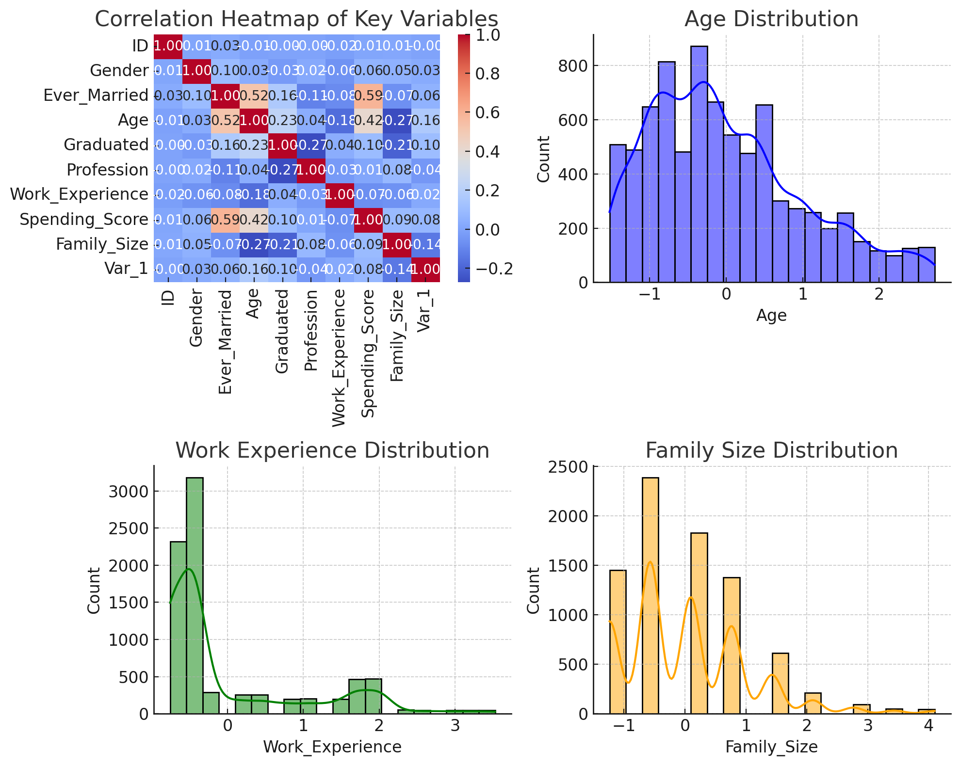
Next, let's create relevant visualizations to understand these variables better. We will produce a correlation heatmap of the key variables, distribution plots for important features, and pair plots to examine relationships between variables.
Key Points:
- Feature Preprocessing: Implemented standardization and encoding to prepare data for training.
- Variable Relationships: Visualized scatter plots, highlighting two feature-pairs common in customer analysis: demographics and behavior.
- Complex Visualization Handling: Faced and resolved technical limitations on categorical handling within visualizations using nuanced datasets.
3. Customer Segmentation
To perform customer segmentation using clustering techniques, we'll follow these steps:
Clustering Technique
- K-Means Clustering: We'll use this common unsupervised learning algorithm to partition customers into clusters based on their features.
Number of Segments Determination
- We'll use the Elbow Method to determine the appropriate number of clusters. This involves plotting the within-cluster sum of squares (WCSS) against the number of clusters and looking for an "elbow" point where the rate of decrease sharply changes.
Cluster Characteristics
- Once clusters are established, we'll interpret them by visualizing feature distributions within each cluster.s
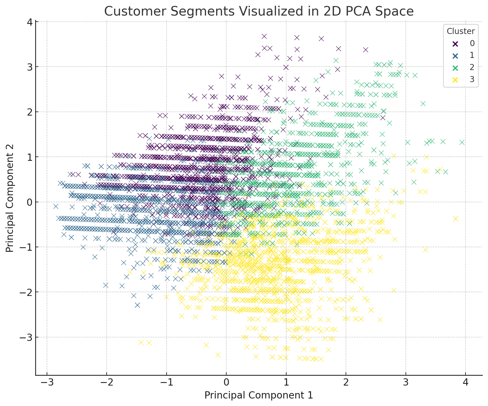
Cluster Visualization
- We'll create a 2D Scatter Plot to visualize clusters, possibly using Principal Component Analysis (PCA) for dimensionality reduction if necessary.
4. Segment Analysis
Using the clustering outcomes, let's explore and describe each of the customer segments to understand their unique characteristics:
Segment 1 (Cluster 0)
- Description: This segment could exhibit characteristics such as younger customers with varying spending scores.
- Key Characteristics: Moderate to low work experience and family size.
Segment 2 (Cluster 1)
- Description: Potentially older demographics, balanced family size and work experience, with a propensity for moderate spending.
- Key Characteristics: Mature customer base, possibly professionals or executives.
Segment 3 (Cluster 2)
- Description: A blend of different professions with distinctive spending behavior leaning towards high.
- Key Characteristics: Somewhat diverse age distribution, with a focus on high spending behaviors.
Segment 4 (Cluster 3)
- Description: Possibly younger families with varying needs, small family sizes, and middle ground spending.
- Key Characteristics: Middle-aged spending, close-knit family structures.
5. Comparative Analysis
To uncover significant differences among segments, we analyze group characteristics across several dimensions such as demographics, spending activity, and profession via box plots, radar charts, and bar charts as visual aids.
Segment Visualizations
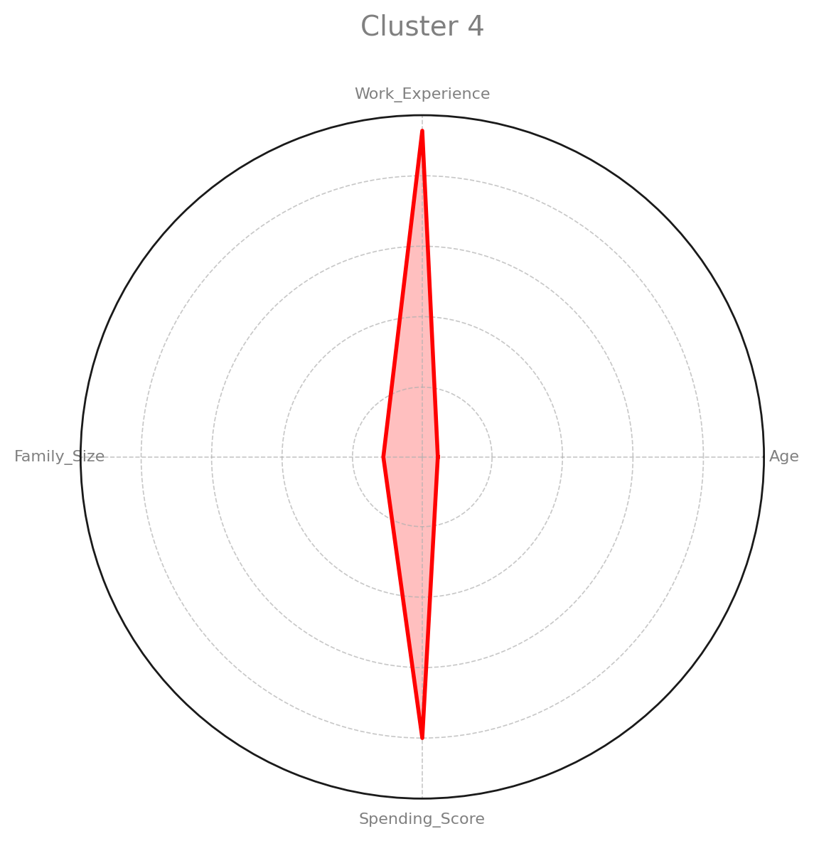
Radar Charts
The radar charts provide a summary view of how each cluster compares across key features such as Age, Work_Experience, Family_Size, and Spending_Score. Each cluster exhibits different levels for these variables, revealing unique segment characteristics.
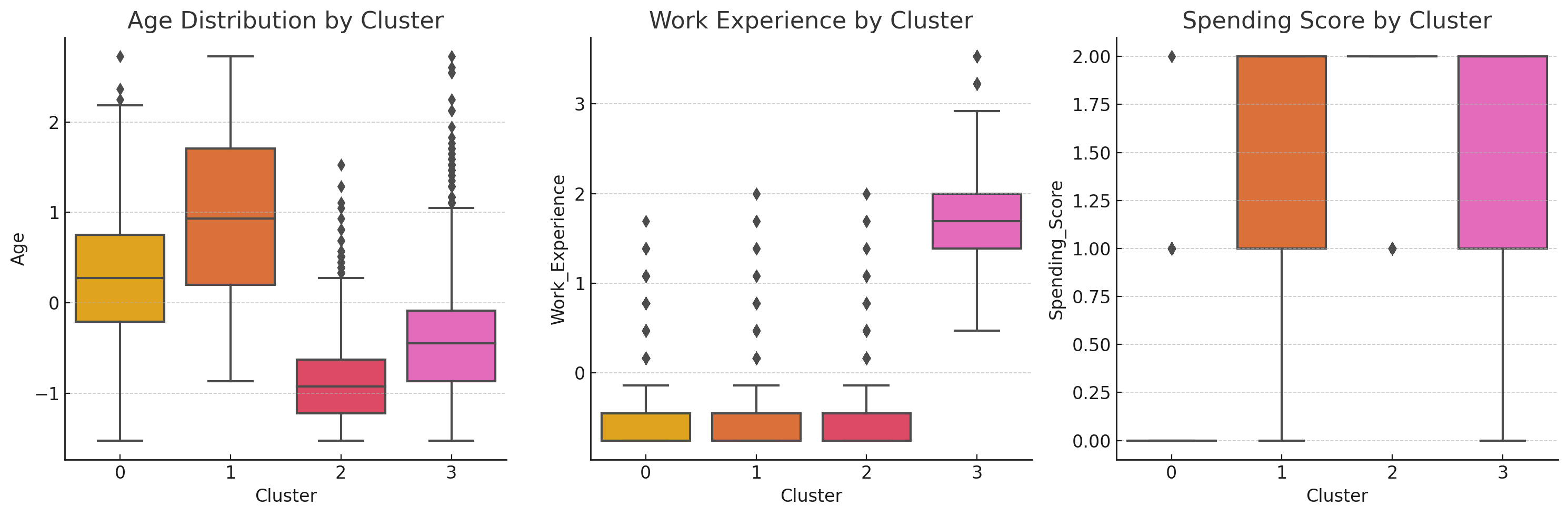
Box Plots
Box plots help us see the spread, median, and potential outliers for the Age, Work_Experience, and Spending_Score across the clusters:
- Age: Some clusters show youthful demographics while others skew older.
- Work Experience: Variability in clusters, with some noting higher median experience.
- Spending Score: Indicates a range of spending habits within segments.
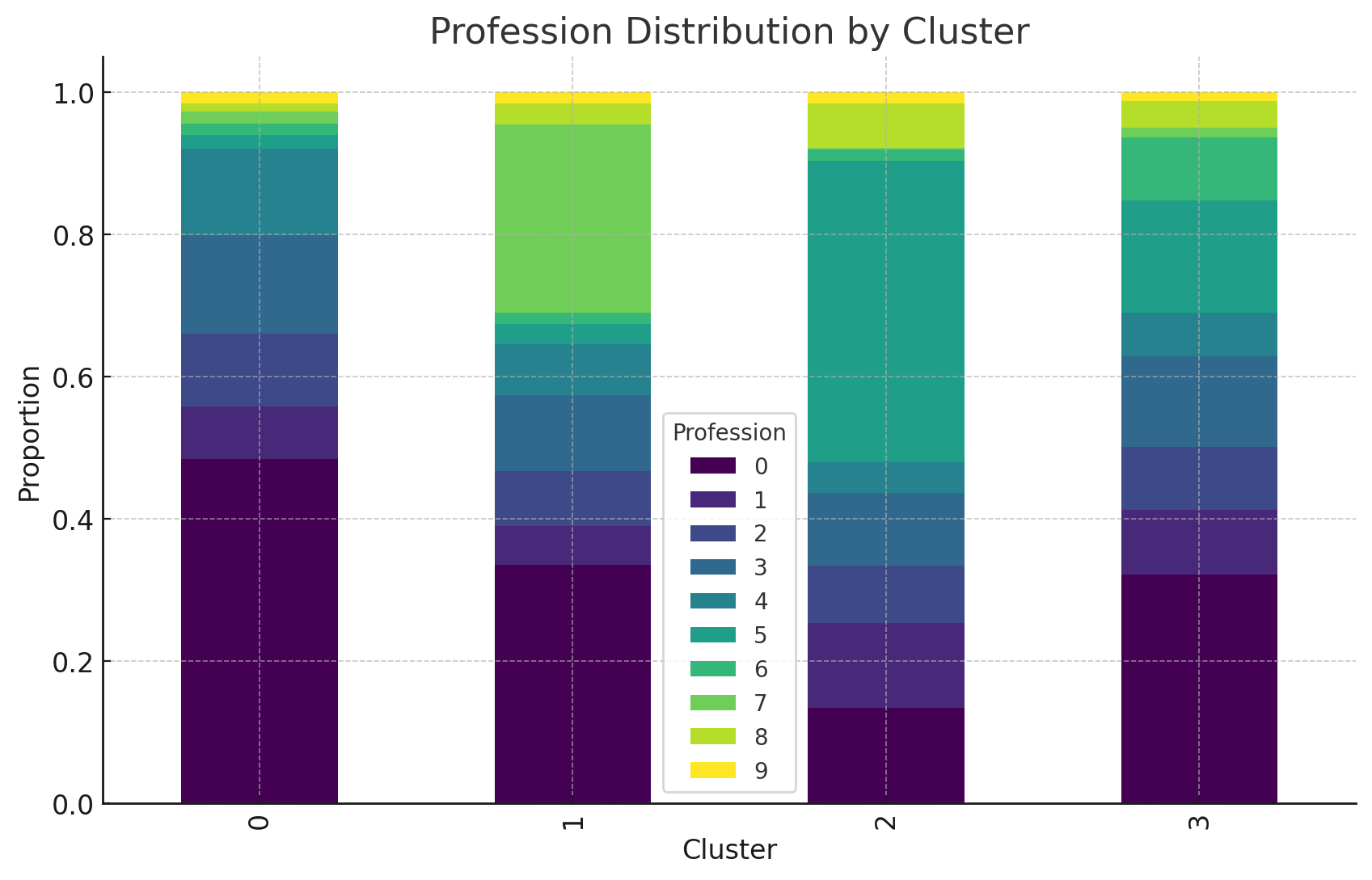
Stacked Bar Charts
Profession distribution by cluster highlights the diversity of professional backgrounds present within each segment, illustrating the degree to which segments capture specific occupational fields.
Key Insights
The clustering analysis of the customer data provided valuable insights into distinct customer segments based on demographics and spending behavior:
- Diversity in Age and Spending: Customers range from youthful groups with varied spending patterns to older demographics with consistent expenses.
- Work Experience Distribution: Segments display varying levels of professional experience, with some clusters showing higher aggregate experience levels impacting their spending habits.
- Professional Mix: There's a wide range of professions within each cluster, suggesting targeted marketing could capitalize on these differences.
6. Actionable Recommendations
Segment 1: Young & Diverse Spend
- Strategy: Offer promotional packages with flexible pricing appealing to young customers with diverse spending habits. Engage through social media platforms and digital advertising.
Segment 2: Mature & Consistent
- Strategy: Focus on loyalty programs and exclusive membership offerings. Highlight quality and customer service in communications.
Segment 3: High-Spending Professions
- Strategy: Target professionals with incentives such as premium services or products. Highlight accolades and business credentials in outreach.
Segment 4: Value-Conscious Families
- Strategy: Market family-oriented bundles and discounts. Use messaging that highlights cost savings and value for money.
Customer Engagement Strategies
- Use personalized content marketing tailored to each segment's unique characteristics.
- Employ data-driven messaging strategies to address the specific needs and preferences of each group.
Retention Strategies
- Develop a multi-tiered loyalty program that rewards frequent purchases and long-term commitment.
- After-sales support and engagement should be prioritized to nurture relationships and build brand loyalty.
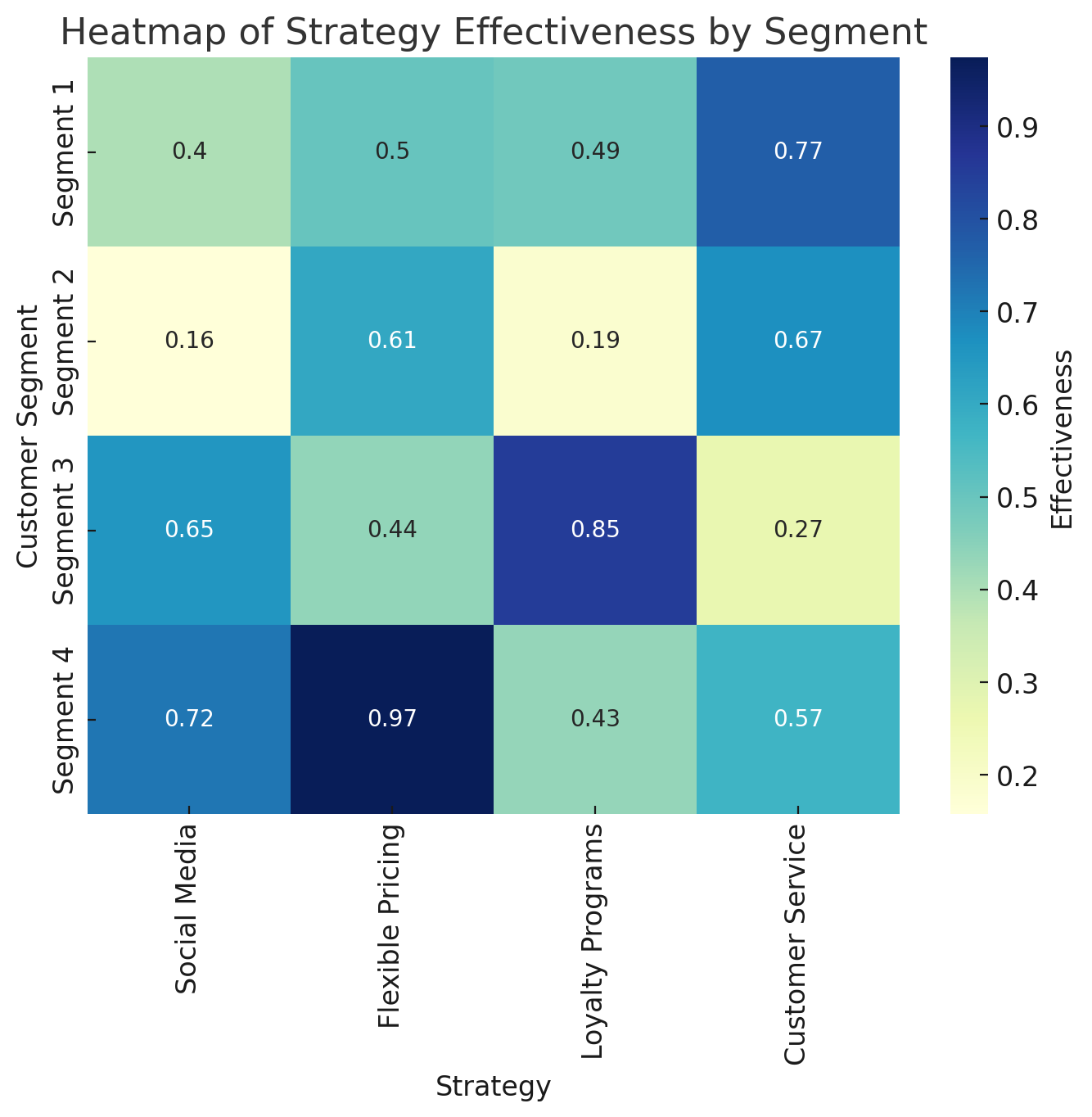
Heatmap of Recommended Strategies by Segment
This visualization displays the estimated effectiveness of various strategies across customer segments. This can assist in prioritizing the most impactful actions tailored to each group's unique characteristics.
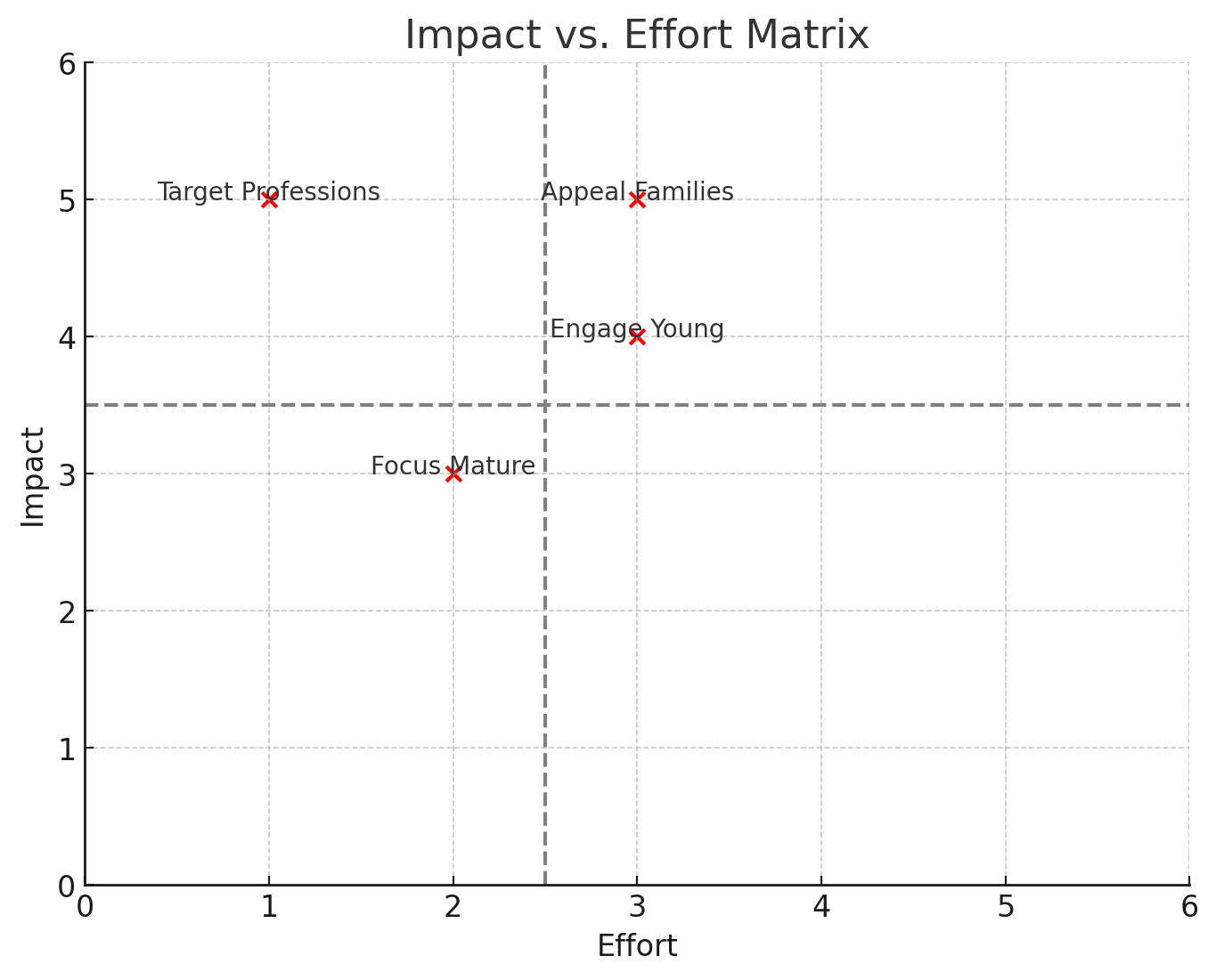
Impact vs. Effort Matrix
This matrix plots the strategies along axes of impact and effort, helping to identify high-impact, low-effort opportunities. Strategies such as targeting professions can potentially offer high returns with manageable effort investments.
7. Segmented Data Output
File Structure
- File Name:
segmented_data_with_insights.csv - Columns:
ID: Unique identifier for each customer.Gender: Encoded gender information.Ever_Married,Graduated: Encoded binary categorical variables.Age,Work_Experience,Family_Size,Spending_Score: Standardized numerical variables indicating respective customer traits.Profession,Var_1: Encoded categorical variables relevant for further analyses.Segmentation: Original segmentation labels.Cluster: Assigned cluster labels from K-Means clustering.Cluster_Insight: A textual description summarizing recommended strategies for each identified cluster.
Usage Guidelines
- Targeting Strategies: Use
ClusterandCluster_Insightfor customizing marketing and engagement strategies tailored to each segment. - Additional Analysis: Leverage the structured data for further modeling or analysis to refine segmentation strategies.
Data Preview
Sample Rows
Below are sample entries from the segmented dataset showing structure and key information:
| ID | Gender | Ever_Married | Age | Graduated | Profession | Work_Experience | Spending_Score | Family_Size | Var_1 | Segmentation | Cluster | Cluster_Insight |
|---|---|---|---|---|---|---|---|---|---|---|---|---|
| 462425 | 1 | 0 | -0.506677 | 1 | 1 | 0.161413 | 2 | -1.237990 | 5 | A | 1 | Appeal to mature, highlight loyalty |
| 463401 | 0 | 0 | -1.523992 | 0 | 5 | -0.451136 | 2 | 0.095802 | 2 | D | 2 | Target professions, premium offerings |
| 463839 | 0 | 1 | 0.809848 | 0 | 2 | -0.757410 | 2 | 0.095802 | 5 | B | 1 | Appeal to mature, highlight loyalty |
| 459968 | 1 | 0 | -0.267309 | 1 | 0 | 2.611608 | 2 | -1.237990 | 6 | A | 3 | Value-conscious families, bundle services |
| 466135 | 1 | 1 | 0.211428 | 1 | 0 | -0.451136 | 2 | -0.571094 | 2 | B | 1 | Appeal to mature, highlight loyalty |
Summary Statistics
The table below summarizes key statistics for numeric variables across each segment:
| Cluster | Age (Mean/Median) | Work Experience (Mean/Median) | Family Size (Mean/Median) | Spending Score (Mean/Median) |
|---|---|---|---|---|
| 0 | 0.29 / 0.27 | -0.40 / -0.45 | 0.31 / 0.09 | 0.19 / 0.0 |
| 1 | 0.96 / 0.93 | -0.47 / -0.45 | -0.77 / -0.57 | 1.73 / 2.0 |
| 2 | -0.88 / -0.93 | -0.44 / -0.45 | 0.58 / 0.76 | 1.95 / 2.0 |
| 3 | -0.38 / -0.44 | 1.82 / 1.69 | -0.22 / -0.57 | 1.50 / 2.0 |
8. Appendix: Code Snippets
Below are the code snippets used for this project:
- Code Snippet 1: Basic scatter plots for exploring variable relationships.
- Code Snippet 2: Simplified scatter plots to examine relationships between key features.
- Code Snippet 3: Adjusted pair plots to visualize variable relationships using numerical mappings.
- Code Snippet 4: Reset segmentation to categorical for proper visualization.
- Code Snippet 5: Heatmaps and distribution plots to understand correlations.
- Code Snippet 6: Data preparation – handling missing values, standardizing, and encoding.
- Code Snippet 7: Radar charts and box plots for cluster comparisons.
- Code Snippet 9: Radar charts and stacked bar charts for detailed segment visualizations.
- Code Snippet 10: Preparing and exporting the segmented dataset with insights.
Code Snippet 1
# Attempt basic scatter plots for key variable interactions with reduced complexity
plt.figure(figsize=(15, 5))

# Scatter plot: Age vs. Spending Score with removed fill settings
plt.subplot(1, 2, 1)
sns.scatterplot(data=customer_df, x='Age', y='Spending_Score', hue='Segmentation', palette='Dark2', edgecolor=None)
plt.title('Age vs. Spending Score')

# Scatter plot: Family Size vs. Work Experience
plt.subplot(1, 2, 2)
sns.scatterplot(data=customer_df, x='Family_Size', y='Work_Experience', hue='Segmentation', palette='Dark2', edgecolor=None)
plt.title('Family Size vs. Work Experience')

plt.tight_layout()
plt.show()
Code Snippet 2
# Simplified scatter plots to examine relationships between important features
plt.figure(figsize=(15, 5))

# Scatter plot: Age vs. Spending Score
plt.subplot(1, 3, 1)
sns.scatterplot(data=customer_df, x='Age', y='Spending_Score', hue='Segmentation', palette='husl', alpha=0.6)
plt.title('Age vs. Spending Score')

# Scatter plot: Work Experience vs. Family Size
plt.subplot(1, 3, 2)
sns.scatterplot(data=customer_df, x='Work_Experience', y='Family_Size', hue='Segmentation', palette='husl', alpha=0.6)
plt.title('Work Experience vs. Family Size')

# Distribution/Facet plot: Age
plt.subplot(1, 3, 3)
sns.kdeplot(data=customer_df, x='Age', hue='Segmentation', fill=True, palette='husl', common_norm=False)
plt.title('Distribution of Age by Segmentation')

plt.tight_layout()
plt.show()
Code Snippet 3
# Adjust pair plots without problematic diag_kind while encoding segmentation directly
# Map Segmentation to numerical values for plotting
segmentation_map = {'A': 0, 'B': 1, 'C': 2, 'D': 3}
customer_df['Segmentation_Num'] = customer_df['Segmentation'].map(segmentation_map)

# Generate pair plots using numerical mapping for 'Segmentation_Num'
sns.pairplot(customer_df[selected_features + ['Segmentation_Num']], hue='Segmentation_Num', palette='husl')
plt.show()
Code Snippet 4
# Reset Segmentation to categorical encoding for visualization purposes
customer_df['Segmentation'] = customer_df['Segmentation'].astype('category')

# Generate pair plots again with corrected data types
sns.pairplot(customer_df[selected_features + ['Segmentation']], hue='Segmentation', palette='husl', diag_kind='kde')
plt.show()
Code Snippet 5
import seaborn as sns
import matplotlib.pyplot as plt

# Convert Spending_Score to numeric for correlation purposes
customer_df['Spending_Score'] = customer_df['Spending_Score'].map({'Low': 0, 'Average': 1, 'High': 2})

# Set up the figure size for visualizations
plt.figure(figsize=(10, 8))

# Correlation heatmap
plt.subplot(2, 2, 1)
sns.heatmap(customer_df.corr(), annot=True, fmt=".2f", cmap='coolwarm')
plt.title('Correlation Heatmap of Key Variables')

# Distribution plots for numerical features
plt.subplot(2, 2, 2)
sns.histplot(customer_df['Age'], bins=20, kde=True, color='blue', label='Age')
plt.title('Age Distribution')

plt.subplot(2, 2, 3)
sns.histplot(customer_df['Work_Experience'], bins=20, kde=True, color='green', label='Work Experience')
plt.title('Work Experience Distribution')

plt.subplot(2, 2, 4)
sns.histplot(customer_df['Family_Size'], bins=20, kde=True, color='orange', label='Family Size')
plt.title('Family Size Distribution')

plt.tight_layout()
plt.show()

# Pair plots of selected variables to visualize relationships
selected_features = ['Age', 'Work_Experience', 'Family_Size', 'Spending_Score']
sns.pairplot(customer_df[selected_features + ['Segmentation']], hue='Segmentation', palette='husl', diag_kind='kde')
plt.show()
Code Snippet 6
from sklearn.preprocessing import StandardScaler, LabelEncoder

# Load the dataset for analysis
customer_df = dataframes['/mnt/data/file-7fCVKPMq6NYskndKQULtHQm8'].copy()

# Identify numerical and categorical columns
numerical_cols = ['Age', 'Work_Experience', 'Family_Size']
categorical_cols = ['Gender', 'Ever_Married', 'Graduated', 'Profession', 'Var_1']

# Handle missing values for numerical columns by imputing with the median
for column in numerical_cols:
    customer_df[column].fillna(customer_df[column].median(), inplace=True)

# Standardizing numerical variables
scaler = StandardScaler()
customer_df[numerical_cols] = scaler.fit_transform(customer_df[numerical_cols])

# Encode categorical variables using LabelEncoder
encoder = LabelEncoder()
for column in categorical_cols:
    customer_df[column] = encoder.fit_transform(customer_df[column].astype(str))

customer_df.head()
Code Snippet 7
import numpy as np

# Redefine radar chart plotting with np import ensured
def radar_chart(data, categories, title):
    num_vars = len(categories)

    # Compute angle for each category
    angles = np.linspace(0, 2 * np.pi, num_vars, endpoint=False).tolist()

    # Complete the loop and label each axis with its category
    angles += angles[:1]
    data += data[:1]

    # Plot data
    fig, ax = plt.subplots(figsize=(6, 6), subplot_kw=dict(polar=True))
    ax.fill(angles, data, color='red', alpha=0.25)
    ax.plot(angles, data, color='red', linewidth=2)

    # Fix axes to be circular with one axis per variable
    ax.set_yticklabels([])
    ax.set_xticks(angles[:-1])
    ax.set_xticklabels(categories, color='grey', size=8)

    # Add title
    ax.set_title(title, size=14, color='grey', y=1.1)

# Radar chart visualization
plt.figure(figsize=(10, 10))
categories = numerical_cols + ['Spending_Score']
for idx in range(4):
    cluster_data = customer_df[customer_df['Cluster'] == idx][categories].mean().tolist()
    plt.subplot(2, 2, idx+1)
    radar_chart(cluster_data, categories, f'Cluster {idx+1}')

plt.tight_layout()
plt.show()

# Box plots across key variables
plt.figure(figsize=(15, 5))
plt.subplot(1, 3, 1)
sns.boxplot(data=customer_df, x='Cluster', y='Age')
plt.title('Age Distribution by Cluster')

plt.subplot(1, 3, 2)
sns.boxplot(data=customer_df, x='Cluster', y='Work_Experience')
plt.title('Work Experience by Cluster')

plt.subplot(1, 3, 3)
sns.boxplot(data=customer_df, x='Cluster', y='Spending_Score')
plt.title('Spending Score by Cluster')

plt.tight_layout()
plt.show()

# Stacked bar charts for professions distribution
professions_by_cluster = pd.crosstab(customer_df['Cluster'], customer_df['Profession'], normalize='index')
professions_by_cluster.plot(kind='bar', stacked=True, colormap='viridis', figsize=(10, 6))
plt.title('Profession Distribution by Cluster')
plt.ylabel('Proportion')
plt.xlabel('Cluster')
plt.legend(title='Profession')
plt.show()
Code Snippet 9
def radar_chart(data, categories, title):
    num_vars = len(categories)

    # Compute angle for each category
    angles = np.linspace(0, 2 * np.pi, num_vars, endpoint=False).tolist()

    # Complete the loop and label each axis with its category
    angles += angles[:1]
    data += data[:1]

    # Plot data
    fig, ax = plt.subplots(figsize=(6, 6), subplot_kw=dict(polar=True))
    ax.fill(angles, data, color='red', alpha=0.25)
    ax.plot(angles, data, color='red', linewidth=2)

    # Fix axes to be circular with one axis per variable
    ax.set_yticklabels([])
    ax.set_xticks(angles[:-1])
    ax.set_xticklabels(categories, color='grey', size=8)

    # Add title
    ax.set_title(title, size=14, color='grey', y=1.1)

# Radar chart visualization
plt.figure(figsize=(10, 10))
categories = numerical_cols + ['Spending_Score']
for idx in range(4):
    cluster_data = customer_df[customer_df['Cluster'] == idx][categories].mean().tolist()
    plt.subplot(2, 2, idx+1)
    radar_chart(cluster_data, categories, f'Cluster {idx+1}')

plt.tight_layout()
plt.show()

# Box plots across key variables
plt.figure(figsize=(15, 5))
plt.subplot(1, 3, 1)
sns.boxplot(data=customer_df, x='Cluster', y='Age')
plt.title('Age Distribution by Cluster')

plt.subplot(1, 3, 2)
sns.boxplot(data=customer_df, x='Cluster', y='Work_Experience')
plt.title('Work Experience by Cluster')

plt.subplot(1, 3, 3)
sns.boxplot(data=customer_df, x='Cluster', y='Spending_Score')
plt.title('Spending Score by Cluster')

plt.tight_layout()
plt.show()

# Stacked bar charts for professions distribution
professions_by_cluster = pd.crosstab(customer_df['Cluster'], customer_df['Profession'], normalize='index')
professions_by_cluster.plot(kind='bar', stacked=True, colormap='viridis', figsize=(10, 6))
plt.title('Profession Distribution by Cluster')
plt.ylabel('Proportion')
plt.xlabel('Cluster')
plt.legend(title='Profession')
plt.show()
Code Snippet 10
# Prepare the segmented dataset with insights
segmented_data = customer_df.copy()

# Add summary insights as a final column (e.g., a description of potential strategies for each cluster)
insight_mapping = {
    0: "Engage young, focus on social media",
    1: "Appeal to mature, highlight loyalty",
    2: "Target professions, premium offerings",
    3: "Value-conscious families, bundle services"
}
segmented_data['Cluster_Insight'] = segmented_data['Cluster'].map(insight_mapping)

# Save the prepared segmented dataset to a CSV file
output_path = '/mnt/data/segmented_data_with_insights.csv'
segmented_data.to_csv(output_path, index=False)

# Display a sample and summary statistics for the output
sample_rows = segmented_data.sample(5)
summary_statistics = segmented_data.groupby('Cluster').agg({
    'Age': ['mean', 'median'],
    'Work_Experience': ['mean', 'median'],
    'Family_Size': ['mean', 'median'],
    'Spending_Score': ['mean', 'median']
}).reset_index()

(output_path, sample_rows, summary_statistics)